This is the first of what will be monthly technical updates covering primarily the U.S. Treasury complex and being 1-month look-backs, this first one could not have come at a more interesting time.
On April 4th treasuries printed their lowest yields since September of 2024, the 5-year had rallied from 4.620 in January to 3.556 on 4/4 and just 5 days later, on the 11th, it was at 4.223, its highest yield since February, and it has remained between those two extremes since.
That kind of volatility is not typical, but nothing that happened in early April was. The SPX, which crested on February 19th at 6147 and traded at 5695 on April 2nd, printed 4835 just 3 days later, a collapse of monumental proportions.
While the volatility which followed was remarkable and while the SPX did recover nearly all those losses, it still spent the entire month of April between the extremes it printed on those 3 days.
The Dollar Index reached a multi-year high of 110.18 on January 17th and on April 1st it was trading at 104.37, but it traded as low as 97.92 on the 21st.
Gold, which has been rallying for years, printed what was then an all-time high just above $3200 an ounce on April 2nd, before dropping to $2970 on April 7th, and then exploding to $3510 on April 22nd, but it was back at $3270 just a day later.
With all that having happened in April, it would take a crystal ball to know what to expect for May. I don’t have a crystal ball, but I do track markets with charts, which I like to think of as roadmaps of sorts.
They don’t show where a market is headed, but they do show where it’s been and how it got there, and with the help of pattern recognition, wave-theory, technical indicators, cycles, volume and open interest, and whatever else might present itself,
I try to figure out where it’s headed. Sometimes I get lost, but journeys can be fun even when you don’t end up where you thought you would.
A brief history of the treasury market is in order before beginning this journey and for me the starting place is September 30, 1981.
On that day the 5-year yield reached 16.27, but from there it reversed and began what would be a 39-year bull market which ended on August 7, 2020, with the 5-year yielding just 19.2 basis points thanks to Covid-19.
From August of 2020 to October of 2023, the 5-year yield went from near zero, back to 5%, and from there it worked its way back down to 3.392 in September of 2024 which remains the lowest yield it has seen since the October 2023 yield crest,
finishing the month of April yielding 3.752. The move down in yield from 2023 to 2024 clearly looks to be a correction, which tells me that it will likely prove to have been a bear market rally.
The shape of the yield curve changes from day to day, but changes as dramatic as those we’ve seen recently create havoc when trying to project in which direction interest rates are headed, so allow me to share just a little bit more market history.
The 5-year yield finished up April about 125 basis points below its yield crest from 2023, the 10-year about 82 basis points, and the 30-year about 47 basis points,
but violent curve shifting was demonstrated more recently when the 5-year yield dropped 107 basis points from its January yield crest into April 4th and then gave back 63% of those gains in just 5 days,
while during the same time the 10-year yield dropped 92 basis points and gave back 77%, and the 30-year yield dropped 66 basis points and gave back 98%.
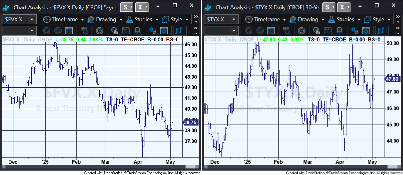
Below are 2 daily yield charts, the one on the left shows 5-year yields, while the one on the right shows 30-year yields (the decimals are misplaced once to the right).
I can read the 5-year as having impulsed down in yield from January 13th to April 4th, and then retraced 62% of the rally at the 4/11 yield crest, which would be a bullish setup,
while 30-year looks more like it impulsed up in yield from April 4th to April 11th, and then retraced 60% of the break, which would be a bearish setup.
Having just one treasury chart present a clear pattern is not unusual but having charts of different maturities offer seemingly clear patterns but with opposite implications is highly unusual.
While the recoveries which began in 2023 appear to me to be corrections, I can’t tell if they are likely completed.
I doubt that they are complete since I don’t see what wave theory says I should see at the end of a correction, nor do I see what the theory says I should see at the beginning of a new trend.
Additionally, corrections typically retrace 1/3rd to 2/3rds of the previous moves, but so far only about 30% of the breaks from 2020 have been recovered by the 5-year and 10-year, and less than that by the 30-year.
Projections created using technical analysis don’t always work, nothing does, much of what markets do can be described as a random walk, but when done well, technical analysis can produce actionable projections which are correct more often than not.
Despite the incredible volatility in early April, both the treasury and equity markets have reacted to technical levels with nothing short of remarkable accuracy, but for the sake of time and space, I’ll show those instances in next month’s update.
I will also get into much more detail about where I think treasuries are and where I think they are headed, and I’ll always try to explain why I think what I do, and hopefully this journey will be fun for all of us.
Imperial Fund Asset Management is a SEC-registered investment adviser.
SEC registration does not imply a certain level of skill or training.
The information provided is for informational purposes only and should not be considered investment advice or a solicitation to buy or sell any securities.
All investments involve risk, including the possible loss of principal. Please review our
full disclaimer for additional information.